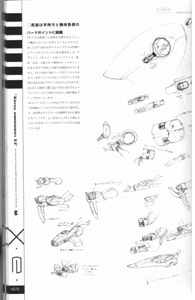
 [Page 05]
My designs do not incorporate elements that have no raison d'être.
Lacquerware is beautiful. Why do we feel that way, even when they're completely without any decorations? Because that design has a purpose. It has a form that delivers the functions we demand from it. Its appearance manages to bring out the natural essence
of the raw materials. There's no need for anything else, so that's all that's there. And that's why it's beautiful.
Including what needs to be there, leaving out what's superfluous. That's minimalism.
So, why are there red and black vessels?
Those are matching tea cups for a husband and wife.
A single drop of emotion within the minimalism. That's the kind of design I like.
Kouichi Mugitani
|
[Page 36]
P r e f a c e
Thank you very much for purchasing "Xeno Emission E1".
This book contains the design work done by me, Kouichi Mugitani, for the PS2 RPG "Xenosaga Episode 1: Der Wille Zur Macht" in
the area of mecha design for which I was responsible.
Moreover, the concept for this book is to provide an explanation for my graphic design work, not to give metafictional explanations for the events or settings of the story. Also, please understand that there might be parts that differ from what was actually used in the game, and that these should not be seen as official materials for the setting.
I'd like to clarify the concepts behind the designs that make up one part of the product called Xenosaga, which isn't really seen in the game, what intentions I had in mind while creating them and how they were completed, by considering this from multiple points of view.
I would be happy if this book could be even a small impetus for readers to embark on their own creative works.
Kouichi Mugitani/CHOCO
 [Page 39]
The current main.
I tried changing her rather boldly...or to put it this way, she doesn't feel like the old mech at all.
Last time, my intentions to "somehow make her like a robot girl, and like a VX-4000 unit" were too [can't read the character
properly due to resolution], and she ended up as a halfbaked compromise between a robot girl and a cute girl. Based on that
experience, this time I tried to put the emphasis on "cuteness" when I made the final touches on her.
As a result of that, I omitted the four arms that are the big distinguishing feature of the VX-4000 series. I also decided that
the backpack not being there would be better for balance, and I downsized things significantly. Since I decided to give her a
headset, fitting in the elf ears was [can't read the character due to resolution].
It's strange to have her wielding submachine guns. Or rather, it's a way of holding them that's "impossible for little girls",
with her arm covers assisting her mechanically...that is to say, if I were to have her holding them the usual way, they'd be
sticking out and disrupting the coherence of the drawing, so I needed to have her hold them close to her body.
By the way, she uses "SMG99AS" submachine guns that aren't in the original story, and don't have carrying handles on the
conceptual drawings. Actually, I probably should have made them Vector-manufactured SMGs, but since I didn't have the [setting]
materials for Vector-made weapons, I had to abandon that idea.
Properties of the VX-4000 girl
Apart from the backpack, this one is the same as the final version.
Parts of her school swimsuit also extend to her [something to do with her butt, but can't make out the last character], and
this (which isn't shown on this illustration) is to deal with it extending past her buttocks.
When it comes to her weapons, I honestly think I should have made them Vector-manufactured, but since I couldn't find the
conceptual drawings, I made them Federation-manufactured instead. Still, Federation-issue submachine guns seems believable
enough, and while Vector-made swords are cool, they can't be used in combat, so...it worked out well in the end, didn't it?
...also, another thing that went into making this drawing was that I added the backpack afterwards, and when I tried drawing
her body, I had to find a good way to deal with the backpack to reduce her body proportions. [A little unsure about that one,
but should be the general idea]
So I settled on getting rid of her backpack and putting a headset on her shoulders instead. It didn't have any of the feel of
her former design, but since it's cute, it's okay, right? ...right?
|
 [Page 53]
However, having come here, Sunrise changed the positioning of the new Gundam Seed franchise significantly. [That's the best I
can do without the rest of the context]
This strategy that could be seen as an attempt to acquire new user groups was a great success, and this was tied to extending
the life cycle of the items (rather than the community). It was a natural reaction for fans who found themselves outside the
target audience to direct strong criticism at the design of the next installment as well. While taking a new positioning like
with Seed, I'd also like to see the differences in position between [not sure about this word, sorry] that result.
What did I intend to do with the VX units?
We finally arrive at the real topic
What I intended to do with the design work for EP1 represented a breakthrough in terms of values. I like new things, and seen
from the viewpoint of users playing the game Xenosaga, it's clear that the VX units designed by me are a really high-risk
design lying on the outside of that value system. That's because what I wanted to present followed a plan incorporating the
elements listed below.
1. Conditioning through authority
There was already a brand established by Xenogears, with its corresponding fanbase.
2. Conditioning through repetition
By their nature, RPGs are expected to span tens of hours, like it or not.
Also, this game has many female users, including fans attracted by the charm of the characters. Couldn't it be possible for us
to open up a new fanbase by targeting this group of users who don't want adherence to classic robot designs, but rather hope
for someone to see it from a neutral viewpoint as [merely] an extention of the product design we're all used to seeing? That's
the possibility I was betting on.
The positioning of the VX units
I'd like you to take one more look at the positions of the VX units on the positioning map. You'll see that the position of
the VX units is in the far upper-right, quite far from the female users (included in the "light users" group) that we wanted
to target. When I was doing design work for EP1, I didn't have this kind of positioning map in mind at the time, and decided
on those positions based on my own preferences without being able to differentiate between myself and others. I thought it'd
be a major breakthrough to let users decide their own position instead, through the methodology I described above.
Unfulfilled intentions
When we first announced this game, we received a response of harsh criticism [to the mech designs], just as we'd expected
since it was the same way with the Gears in Xenogears. However, unlike with the Gears, this time opinions didn't change as
time went on and the designs took root. Even the small group of fans who appreciated it weren't the kind of new fan group who
would be able to take on board this kind of design through an innovative breakthrough in the first place. Which means that our
initial intentions met with failure.
Considering the reasons for this failure, they might be:
1. The quality of the design work itself.
The quality of each individual design couldn't measure up to the demands of this new challenge at all.
They weren't synchronized with the other visuals in the game either.
2. The game "Xenosaga EP1" didn't pursue innovation.
The style of the game itself was based on styling up classical elements (even the keywords drew their
authority from the likes of mythology and the Bible), the design work that would serve as the tools for bringing this [kind
of] vision to life didn't need to have any exceptional quality, and the users weren't looking for quality in this area either.
3. We didn't make use of conditioning through repetition.
Since the mechs didn't even appear on screen.
Another reason for our failure that was very different from our expecations was that even if [users] wouldn't take well to my
designs, for example, Mr. Ishigaki's designs were supposed to be there as a back-up [lit.: guarantee]. However, in the end
even Mr. Ishigaki somehow ended up making challenging designs!
Our intentions for EP2
Based on our reflections from EP1, we changed our design approach for EP2 with a new set of intentions in mind. I'll leave
the detailed discussion of why we had the positioning map show only the position of the ES units for another time.
The term "stylish" is already meaningless
At least according to this designer, who just sends things out into the world. The term "stylish" is something that should
be expressed subjectively by users, not by a designer who is just a sender. That's because a designer needs to be aware of
whose value system he is designing things for, and of the several ways to use the term "stylish" properly.
MOMO?
Why is there a nude of MOMO on the previous page? I think those readers who have kindly stuck me with me this far might
probably understand why.
I still can't drink black coffee. Kouichi Mugitani
In an era where there is such a wide variety of value systems, the term "stylish" has lost its meaning.
|
 [Page 60]
Vector's Logomark
Actually, the very first thing I delivered to Monolithsoft was Vector's Logomark.
Based on the assignment of the distinct motif of the Tai Chi {Yin-Yang} symbol, but with originality, I tried to design it,
being conscious of a high-class sense and visual quality of when it would be attached as an emblem to an in-house product.
The lettering is made to be something non-ornamental, like a large corporation that has already established a brand.
At the time it was delivered, I had meant for the color sketch to be a proof-of-concept image, not the final product. So, for
balance validation, I included a temporary catch-phrase:
"HERE THE FUTURE"
That's right. Hitachi's old catch-phrase. In order to help to understand at first glance that it was just a stand-in, I had
included a famous catch-phrase. But as time flows...
The next thing I remember was when I saw Vector's logo on the binder enclosed in the premium box. "They're using it just like
that~~~~~!"
That means, Vector became a company that has the same catch-phrase as Hitachi. Director Takahashi reasoned, "It's fine, isn't it?" And so it's fine.
As a side-note, the auto-maker called "VECT" that appeared in Namco's game "Ridge Racer" had a company name and logo that was a spitting image of mine, but there is nooooo relation to Vector. It's a coincidence that seems like a joke.
In addition, Salomon's and Mild Seven's logomarks look similar as well. It may be because they have the same roots.
|
 [Page 68]
Head
The VX head is extremely simple. This is due to the information density [required] to have just one part be different in an
industrially manufactured product, and it would be unnatural to have this regulated by a special rule. Even if you look at
[the head] as a storytelling tool for the game instead, would a "face" be able to deliver a convincing performance? Based on
this consideration, I tried giving it a triangular shape to make it an element to help users look at this machine and
recognize it as "humanoid".
In line with the concept, the neck joints would be flat and level with a rubber covering, and I also [the unit] should show
some self-assertaion as the player's [machine? Hard to read this character due to resolution], so I added a rather symbolic
crest right in the middle. I turned in this crest design intending it to be the final version, but since it turned out to
lack realism when trying to look at it as a "real-world product", I redesigned just the head part and published it as the
VX-10000b model. I'm grateful they allowed me to change it so late, and that was a big help to me.
This triangular head shape itself made it feel like a "face", with the part connecting that triangle to the main body being
the "neck". However, it seems like many people saw the triangle as "the brim of a big hat", with the neck part looking like
"a face hidden beneath the brim". So we added a "visor resembling sunglasses below the brim" that didn't exist in the setting
before, through the illustrations Mr. Yumisuke Kotoyoshi contributed to "Weekly Xenosaga".
|
 [Page 70]
Weapons held in the hands and equipped to each of the machine's hardpoints
For the VX [series], I considered various things such as having a modular construction where the forearms and weapons could be
swapped out, but through fine-tuning it against the AG [series] and looking at the specifications of the battle system, I ended
up at the style seen in the game. By design, the VX series has a total of 9 [can't read due to resolution] hardpoints, including
the shoulders, belows, buttocks and thighs. However, the ones on the buttocks and thighs aren't used. The VX-10000 only has a
cover for its hardpoints on the shoulders because I designed them early on before deciding on the specifications for the
hardpoints. Since the AGWS are about the same size as people, I gave them grips people would be able to grab hold of to
illustrate the human scale. [A little unsure about this one, but should be in the vicinity]
Since I designed the hardpoints for the VX [series] in advance, I was able to get the ones for the AG [series] done along with
them to the same standard. These parts are useful for filling out the surfaces and clarifying the scale. If you look closely,
you'll see that Simeon has a small version of one of these attached to its shoulder too, to show how large its body is.
|
 [Page 72]
Foot parts
Like the shoulders, for the thigh joints I abandoned the flat, level design and made them a complete block construction instead.
The knee joins sit inside a big disc, with a form like the tire of a bike. Along those lines, I kept the level design so that no
matter how far the joints would bend, there wouldn't be any gaps. ...or that's how it was supposed to be, but here I made a big
mistake. I noticed that the in-game graphics would be able to show off gaps [in the joints] in an interesting way, and ended up
trying to emphasize that. Even though this graphical effect would disappear as soon as the joints moved even a little, and even
though I was supposed to have a flat, level design concept...coupled with how complicated the situation was, it all ended up
being unsatisfying, and I didn't know what to do.
Unlike hand-drawn anime, one of the advantages of 3D CG is that as long as you model something once, it won't fall apart later,
even delicate curves. I wanted to take advantage of that in this situation too, and tried to bring out a beautiful, straight
line going from the thigh joints to the tips of the toes. But I made a mistake here, too. Due to the client's request that the
ankles should be able to move, and since I didn't want to get rid of the line, I drew a line through the whole body and decided
that "it should be able to move just fine this way".
If the joints move even a little (snip [no closing bracket, apparently] you might as well be working with sculpture, right?
[Not quite sure what's going on with this part...almost looks like part of the text is missing?]
It should be a given to design something that's supposed to be a movable part with the premise that it'll actually be able to
move!
|
 [Page 109]
The VX-x001 series is a 2004 redesign of the VX series I designed about 4 years ago.
However, [making] this design wasn't just a matter of using the earlier concept as a base and changing my approach, as in "I
want to change up the design from back then if I can". The old design was a hectic project strictly ruled by specifications
from the client and the concepts I came up with myself. This time, with those restrictions lifted, the design work was more
of a leisurely adventure with a paintbrush. So [the old design] could even be called "the VX series I really had to work to
create".
In the course of my design work, I poured my own images and passions unchanged into the things I created. Then I took the
results and subjected them to "illustration cleanup" by adjusting important aspects, for example the clearance of the joints,
to turn it all into something satisfactory the client would be able to use. I call this "product cleanup".
How do you turn the former images into the latter while keeping them intact? That's one of the harder parts of design, as
opposed to illustrating. Still, for this project where I didn't have to deal with any limitations, it was just a matter of
doing some "illustration cleanup", and I was able to finish it all rather quickly.
[]VX-1001
There's almost nothing left of the original model. When I changed the joints mechanism, it gave the robot a flatter feel, but
they wouldn't have been able to bend properly if I'd left it like it was.
[]VX-9001
I liked the details on the original frame, so I just made a few adjustments to the proportions. I hope these changes turn out
okay...?
[]VX-7001
The original strayed from its concept, and the design theme was a mishmash of several things, so I redesigned it with a more
focused mind. VX-7000 was the original model for EP2's ES Asher, or to put it another way, Asher is VX-7000 turned into an ES
unit. For this one I tried the opposite approach, by taking Asher's design and turning it into an AGWS unit.
[]VX-20001
I tried giving it a design that would emphasize its "mountain-like bulk" even more than the original did.
[]VX-4001
Here I just piled on whatever details came to mind without thinking about it too much. That said, it'd be absurd to call it
something I designed without using my brain cells at all. This was the one thing I had force myself to work on the most four
years ago! [A bit unsure about this part, but should be something along those lines]
It looks almost identical to the Nyan Nyan Strikers contribution I made for Mr. Nishida a long time ago, which is proof that
I'm just plagiarizing myself.
[]Carapace supplement
For the product photos shown alongside the VX series on P0016-0021, I looked for colors and themes matching each machine to
express the connection between the VX [series] and the physical products. I didn't draw any particular inspiration from
kukini. I had to resort to Yahoo auctions to get hold of the Coca Cola-style Sony Network Walkman (no longer sold) for those
photos.
|
 [Page 110]
If you consider the VX-x001 series a heretical evolution, the VF-10000 series would be a more orthodox evolution of the VX
series. There is a metafictional explanation for the carapaces, but with this VF series I was [also] struggling to come up
with a new design within the concept and limitations of the VX-10000 series.
The distinguishing aspect of the VF-10000 series is their big glass covers. This was my attempt to find a way to reconcile
the contradiction between details that would complicate the design and add to the information load, and creating a form that
would give a simple, clear and easily understood impresion.
When you see it from a distance, the reflection hides the inside of the glass cover, and it leaves you with the impression
of a simple form. When you see it up close, you're able to appreciate all the intricate detail. This also gives [the robot]
an interesting silhouette, while keeping a familiar "humanoid" shape inside, providing a feeling of safety in accordance
with the "dendrobium principle".
There's a few traces of this approach left in EP2, in the form of ES Dinah.
|
|

